- Advanced
- Components
- Accordion
- Autocomplete
- Avatar
- Avatar Group
- Breadcrumb
- Button
- Card
- Checkbox
- Chip
- Dropdown
- Field
- Heading
- Icon box
- Input
- Input File
- Input Number
- Kbd
- Link
- List
- Message
- Pagination
- Paragraph
- Placeholder
- Placeload
- Popover
- Primitive Field
- Progress
- Progress Circle
- Prose
- Radio
- Select
- Slider
- Snack
- Switch Ball
- Switch Thin
- Tabs
- Tag
- Text
- Textarea
- Theme Toggle
- Toast
- Tooltip
- Utilities
- Snippets
Avatar
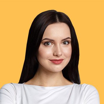
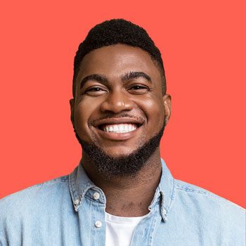
<BaseAvatar /> · A profile picture, or initials as a fallback text.

<template>
  <BaseAvatar src="/img/people/29.jpg" />
  <BaseAvatar text="L" class="bg-muted-200 dark:bg-muted-800" />
</template>
Features
- Control over image render
- Fallback accepts any children
- Built-in badges and masks
Anatomy
This component accepts images and fallback text as props or children. It also has built-in badges and masks, as well as useful utilities to control size and border radius.
<template>
  <BaseAvatar>
    <!-- Image or fallback here -->
  </BaseAvatar>
</template>
API Reference
This component has props and slots. The slots are used to customize the content of the component.
| Prop | Type |
|---|---|
srcdefault: - | stringThe URL of the image to display. |
src-darkdefault: - | stringThe URL of a dark version of the image to display when the component is in dark mode. |
badge-srcdefault: - | stringThe URL of a badge to display on top of the image. |
altdefault: - | stringThe alt text of the image. |
textdefault: "?" | stringThe text to display below the image. |
sizedefault: "sm" | "sm" | "xxs" | "xs" | "md" | "lg" | "xl" | "2xl" | "3xl" | "4xl"The size of the image. |
roundeddefault: "full" | "sm" | "full" | "md" | "lg" | "none"The radius of the image. |
maskdefault: - | "hex" | "hexed" | "deca" | "blob" | "diamond"Applies an svg mask from the available presets. (needs rounded to be set to `none`). |
bindingsdefault: {} | { image?: AvatarImageProps; dark?: AvatarImageProps; fallback?: AvatarFallbackProps; }Optional bindings to pass to the inner components. |
classesdefault: {} | { root?: string | string[]; image?: string | string[]; dark?: string | string[]; fallback?: string | string[]; badge?: string | string[]; }Optional classes to pass to the inner components. |
as-childdefault: - | booleanChange the default rendered element for the one passed as a child, merging their props and behavior. Read our [Composition](https://www.reka-ui.com/docs/guides/composition) guide for more details. |
asdefault: - | AsTag | ComponentThe element or component this component should render as. Can be overwritten by `asChild`. |
| Slot | Type |
|---|---|
#default | any |
#badge | any |
Examples
Size
Use the size prop to control the size of the avatar.


<template>
  <BaseAvatar src="/img/avatars/10.svg" size="lg" />
</template>
Fallback
Use the text prop to add a fallback text to the avatar. Use tailwind classes to style the container and the text.
<template>
  <BaseAvatar size="md" text="L" class="bg-primary-500/20 text-primary-600" />
</template>
Radius
Use the rounded prop to control the avatar border radius.


<template>
  <BaseAvatar src="/img/avatars/16.svg" rounded="none" />
  <BaseAvatar src="/img/avatars/10.svg" rounded="sm" />
  <BaseAvatar src="/img/avatars/25.svg" rounded="md" />
  <BaseAvatar src="/img/avatars/24.svg" rounded="lg" />
  <BaseAvatar src="/img/avatars/15.svg" rounded="full" />
</template>
Badge
Use the badge-src prop to add a badge to the avatar.

<template>
  <BaseAvatar
    src="/img/people/29.svg"
    size="md"
    badge-src="/img/vector/stacks/js.svg"
  />
</template>
Chip
Wrap the avatar component with a Chip component to add a status indicator. Use the chip props to control the indicator color and position.
<template>
<BaseChip
placement="top-end"
:offset="4"
color="custom"
class="text-sky-400"
>
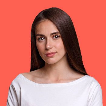
<BaseAvatar
src="/img/people/43.jpg"
rounded="full"
size="md"
dot="pink"
/>
</BaseChip>
</template>
Mask
Use the mask prop combined with the none radius to add an svg mask to the avatar.

<template>
  <BaseAvatar src="/img/avatars/2.svg" rounded="none" mask="hex" />
  <BaseAvatar src="/img/avatars/10.svg" rounded="none" mask="hexed" />
  <BaseAvatar src="/img/avatars/25.svg" rounded="none" mask="blob" />
  <BaseAvatar src="/img/avatars/24.svg" rounded="none" mask="deca" />
  <BaseAvatar src="/img/avatars/15.svg" rounded="none" mask="diamond" />
</template>
Slot
Use the default slot to insert a custom image into the avatar.

<template>
  <BaseAvatar
    size="md"
    rounded="full"
  >
    <NuxtImg
      loading="lazy"
      decoding="async"
      src="/img/people/44.jpg"
      class="rounded-full"
      alt=""
    />
  </BaseAvatar>
</template>